有没有办法改变 CSS 调整角的位置?
Is there a way to change the CSS resize corner's position?
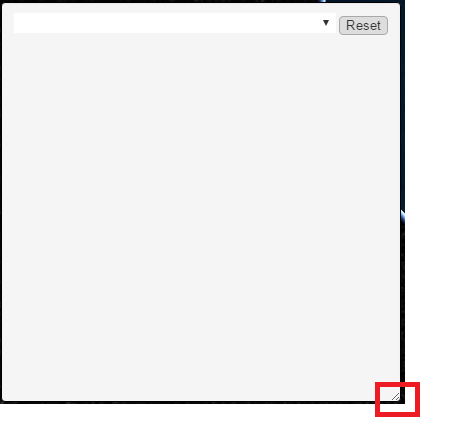
所以这是一个有点奇怪的问题。使用可调整大小 div 编写 Web 应用程序。我目前正在使用 CSS 调整大小 属性,因为这似乎是最简单的方法。问题是我的盒子有一个锁定的底部和左侧位置(我想保持),但默认选择的调整大小角是右下角,这会产生奇怪的调整顶部大小的结果。在网上环顾四周,但找不到将该角移动到右上而不是右下的方法。关于如何产生这个结果有什么建议吗?也不反对使用不同的调整大小的方法。这是应用于框的当前样式:
display: block;
font-size: 9pt;
position: absolute;
bottom: 50px;
left: 20px;
padding: 10px;
min-height: 0;
min-width: 0;
border: solid 1px black;
width:400px;
height:400px;
resize: both;
overflow-x: auto;
overflow-y: hidden;
这是一张有问题的 div 的图片,其中的角上目前有调整大小工具。任何建议将不胜感激。我非常乐意详细说明我也可能错过的事情。谢谢!
这是一个起点。我基本上在右上角创建了一个自定义调整大小图标。然后,我使用 'mousedown'、'mousemove' 和 'mouseup' 事件来跟踪大小调整 activity。您也许可以使用 'drag' 和相关事件来做类似的事情。
请注意 'mousedown' 在调整大小图标上,而 'mousemove' 和 'mouseup' 在文档正文中(或可调整大小的 div 后面的其他较大元素) .
为了简单起见,我在 JavaScript 中硬编码了宽度和高度。这意味着这些值存在于两个不同的地方,这是不好的。您可能应该只将它们放在 JavaScript 或 CSS 中,而不是像我所做的那样将它们放在两者中。
我需要将可调整大小的 div 放入一个充满正文的容器中。否则 'mousemove' 可调整大小 div 之外的事件不会被注册。如果您已经有其他内容 "behind" 您的绝对定位可调整大小的元素,这可能不是问题。
供您参考:我最初也尝试过使用本机调整大小功能。我使用 transform: rotate(-90deg) 将调整大小的角移动到右上角,然后放入内部 div 和 transform: rotate(90deg) 使内部内容再次向右上方移动。然而,虽然这将调整大小的角放在正确的位置,但调整大小本身完全混乱了,因为鼠标移动和实际调整大小本身偏离了 90 度。这有点难以用语言来描述,但足以说明,如果没有一些重大的重新工作(或者可能是一些出色的代码或隐藏功能),我无法使该策略起作用。
var
  doc = document,
  ht = 400,
  wd = 400,
  main = document.querySelector("#resizable"),
  x, y, dx, dy;

var startResize = function(evt) {
  x = evt.screenX;
  y = evt.screenY;
};

var resize = function(evt) {
  dx = evt.screenX - x;
  dy = evt.screenY - y;
  x = evt.screenX;
  y = evt.screenY;
  wd += dx;
  ht -= dy;
  main.style.width = wd + "px";
  main.style.height = ht + "px";
};

rsz.addEventListener("mousedown", function(evt) {
  startResize(evt);
  doc.body.addEventListener("mousemove", resize);
  doc.body.addEventListener("mouseup", function() {
    doc.body.removeEventListener("mousemove", resize);
  });
});
#container {
  position: absolute;
  border: solid red 1px;
  margin: 0;
  height: 100%;
  width: 100%;
}
#resizable {
  display: block;
  font-size: 9pt;
  position: absolute;
  bottom: 50px;
  left: 20px;
  padding: 10px;
  min-height: 0;
  min-width: 0;
  border: solid 1px black;
  width: 400px;
  height: 400px;
  overflow-x: auto;
  overflow-y: hidden;
}
#rsz {
  position: absolute;
  right: 0;
  top: 0;
  width: 20px;
  height: 20px;
  background-color: rgba(255, 0, 0, 0.5);
}
#original {}
<div id="container">
  <div id="resizable">
    <div id="rsz"></div>
    (some content)
  </div>
</div>
如果您 运行 来自 Stack Overflow 中的此代码片段,则需要在单击 "Run code snippet" 后单击 "Full page" 来扩展 运行ning 视图区域。
这是给你的技巧:
.outer-ne-resize {
  resize: both;
  overflow: auto;
}

.inner-ne-resize,
.outer-ne-resize {
  transform: rotateX(180deg);
  height: 100%;
  width: 100%;
}

.content {
  height: 100%;
  background-color: lightgray;
}
<div class="outer-ne-resize">
  <div class="inner-ne-resize">
    <div class="content">
      <p>Lorem ipsum content Lorem ipsum content Lorem ipsum content.<br>
      Lorem ipsum content Lorem ipsum content Lorem ipsum content.
      </p>
    </div>
  </div>
这个 hack 的问题是它仍然按照光标指示的相同的 nwse 方向调整大小。这意味着当你从顶部下拉时它不会收缩,它会从底部扩展。
几年过去了,还在寻找方法。
我现在找到了一种调整右下角定位元素大小的方法,使用左上角调整锚点。
它似乎在 chrome 中按预期工作,但它取决于远未在任何标准中定义的行为,因此最好不要在任何生产环境中依赖它,除非你有控制 clients/browsers 使用此代码的内容。
完整示例及说明可在此处找到:
https://jsfiddle.net/ElMoonLite/zvok7p1f/
核心代码:
<div class="bottomright-with-nw-resize-outer">
    <div class="bottomright-with-nw-resize-inner">
        Lorem ipsum content Lorem ipsum content Lorem ipsum content.<br>
        Lorem ipsum content Lorem ipsum content Lorem ipsum content.
    </div>
</div>
.bottomright-with-nw-resize-outer {
    transform: rotateZ(180deg);
    resize: both;
    overflow: auto;
    padding: 0 8px 8px 0;
    position: fixed;
    bottom: 10px;
    right: 10px;
    height: 100px;
    width: 100px;
}

.bottomright-with-nw-resize-inner {
    transform: rotateZ(180deg);
    width: 100%;
    height: 100%;
    overflow: auto;
}
另一个肮脏的 hack:将容器的 direction 设置为 rtl,角落将在左侧
.resizable {
    resize: both;
    overflow: auto;
    direction: rtl
}
请记住,您需要将内部 div 中的 direction 设置回 ltr,以便文本按您预期的方式显示:
.content {
    direction: ltr
}
这是一个内联版本,其工作方式与我期望的正确拖动锚点相同。
请注意,它有两个手柄,一个位于我想要的右上角,另一个位于垂直轴的底部。
关于垂直滚动的注意事项
.vertical-scroll { //也可以作为多个x-flip和x-flipback元素的包装
最小高度:20px; //这可以防止与底片重叠
resize:vertical;
overflow:auto; //如果没有设置高度属性,则在用户输入之前这是未定义的
}
替代我在元素外部使用垂直滚动 class 的代码片段。也许如果有多个子翻转和向后翻转元素,在底部对齐一个垂直滚动点会更好看。
甚至取消垂直滚动 class。
.resize-x-handle-flip {
transform: rotateX(180deg);
resize: horizontal;
overflow: auto;
width: 200px;
background:lightcyan;
}
.x-text-flip-back {
transform: rotateX(180deg);
}
.vertical-scroll {
min-height:20px;
resize:vertical;
overflow:auto;
}
<div class="resize-x-handle-flip">
 <div class="x-text-flip-back">
  <div class="vertical-scroll">
    Lorem ipsum dolor sit amet, consectetur adipiscing elit, sed do eiusmod tempor incididunt ut labore et.<br> dolore magna aliqua. Ut enim ad minim veniam, quis nostrud exercitation ullamco laboris.
  </div>
 </div>
</div>
只是一个从 Andrew Willems 到 JS 的重构解决方案 类 也保持你的全局范围干净并且能够将它应用到多个 div
如果您 运行 来自 Stack Overflow 中的此代码片段,则需要在单击“运行 代码片段”后单击“整页”来展开 运行ning 查看区域".
class Resizehandler {
    constructor(targetDivID, pullTabID) {
        var d = document;
        var pullTab = d.getElementById(pullTabID);
        this.target = d.querySelector(targetDivID);

        this.ht = 400; this.wd = 400;
        this.x = 0; this.y = 0;
        this.dx = 0; this.dy = 0;

        var resizeFn = this.resize.bind(this);
        pullTab.addEventListener("mousedown", (evt) => {
            this.x = evt.screenX;
            this.y = evt.screenY;
            d.body.addEventListener("mousemove", resizeFn);
            d.body.addEventListener("mouseup", () => {
                d.body.removeEventListener("mousemove", resizeFn);
            });
        });
    }

    resize(evt) {
        this.dx = evt.screenX - this.x;
        this.dy = evt.screenY - this.y;
        this.x = evt.screenX;
        this.y = evt.screenY;
        this.wd += this.dx;
        this.ht -= this.dy;
        this.target.style.width = this.wd + "px";
        this.target.style.height = this.ht + "px";
    };
}
new Resizehandler("#resizable", "rsz");
#container {
  position: absolute;
  border: solid red 1px;
  margin: 0;
  height: 100%;
  width: 100%;
}
#resizable {
  display: block;
  font-size: 9pt;
  position: absolute;
  bottom: 50px;
  left: 20px;
  padding: 10px;
  min-height: 0;
  min-width: 0;
  border: solid 1px black;
  width: 400px;
  height: 400px;
  overflow-x: auto;
  overflow-y: hidden;
}
#rsz {
  position: absolute;
  right: 0;
  top: 0;
  width: 20px;
  height: 20px;
  background-color: rgba(255, 0, 0, 0.5);
}
#original {}
<div id="container">
  <div id="resizable">
    <div id="rsz"></div>
    (some content)
  </div>
</div>
以下解决方案使用了 'move object' 技术,但保留了右下角。左上角的标准 html 箭头接受向下的光标,您现在可以 'drag' 框在左下角保持原位的同时,有效地重新调整框的大小,但从左上角开始。
此代码独立运行:
<html>
<head>
<script>
document.onmousedown=myMouseDown;
document.onmouseup=myMouseUp;
var can_drag=false;
var moving;
function obj_move(e) {
if (can_drag) {
moving.style.left =(e.clientX)+'px';
moving.style.top =(e.clientY)+'px';
return true;
}
}
function myMouseUp(e) {
can_drag=false;
}
function myMouseDown(e) {
var selected_item=event.srcElement;
if(selected_item.className=="drag") {
moving=document.getElementById('test');
can_drag=true;
document.onmousemove=obj_move;
}
return true;
}
</script>
</head>
<body>
<div style='position:absolute;top:50px; left:200px;right:600px;bottom:300px; border:1px solid black;overflow:scroll' id='test'>
<span class='drag' style='cursor:pointer'>⇱</span>
<br>
<p>Lorem ipsum dolor sit amet, consectetur adipiscing elit. Duis vel velit blandit, convallis est vel, feugiat
lorem. Suspendisse aliquam turpis eu posuere fermentum. Proin ullamcorper, purus vitae pulvinar congue,
odio augue cursus diam, et semper mauris eros et odio. Nam vestibulum est scelerisque, accumsan ligula sed,
pulvinar justo. Duis scelerisque ligula eget facilisis molestie. Suspendisse et consequat nunc, at ultrices risus.
Duis varius nisl in nibh convallis fermentum. Mauris posuere neque placerat posuere ultrices.
Suspendisse eget massa ligula. Vestibulum quis elit justo. Maecenas sed augue fringilla, luctus leo eget,
tincidunt dui. Aliquam ligula enim, condimentum vitae vestibulum vitae, rutrum sed turpis. Vivamus vitae nibh erat.
Duis laoreet quis turpis eu eleifend. Suspendisse nec ultrices augue, vel suscipit sem.
<br>
</div>
所以这是一个有点奇怪的问题。使用可调整大小 div 编写 Web 应用程序。我目前正在使用 CSS 调整大小 属性,因为这似乎是最简单的方法。问题是我的盒子有一个锁定的底部和左侧位置(我想保持),但默认选择的调整大小角是右下角,这会产生奇怪的调整顶部大小的结果。在网上环顾四周,但找不到将该角移动到右上而不是右下的方法。关于如何产生这个结果有什么建议吗?也不反对使用不同的调整大小的方法。这是应用于框的当前样式:
display: block;
font-size: 9pt;
position: absolute;
bottom: 50px;
left: 20px;
padding: 10px;
min-height: 0;
min-width: 0;
border: solid 1px black;
width:400px;
height:400px;
resize: both;
overflow-x: auto;
overflow-y: hidden;
这是一张有问题的 div 的图片,其中的角上目前有调整大小工具。任何建议将不胜感激。我非常乐意详细说明我也可能错过的事情。谢谢!
这是一个起点。我基本上在右上角创建了一个自定义调整大小图标。然后,我使用 'mousedown'、'mousemove' 和 'mouseup' 事件来跟踪大小调整 activity。您也许可以使用 'drag' 和相关事件来做类似的事情。
请注意 'mousedown' 在调整大小图标上,而 'mousemove' 和 'mouseup' 在文档正文中(或可调整大小的 div 后面的其他较大元素) .
为了简单起见,我在 JavaScript 中硬编码了宽度和高度。这意味着这些值存在于两个不同的地方,这是不好的。您可能应该只将它们放在 JavaScript 或 CSS 中,而不是像我所做的那样将它们放在两者中。
我需要将可调整大小的 div 放入一个充满正文的容器中。否则 'mousemove' 可调整大小 div 之外的事件不会被注册。如果您已经有其他内容 "behind" 您的绝对定位可调整大小的元素,这可能不是问题。
供您参考:我最初也尝试过使用本机调整大小功能。我使用 transform: rotate(-90deg) 将调整大小的角移动到右上角,然后放入内部 div 和 transform: rotate(90deg) 使内部内容再次向右上方移动。然而,虽然这将调整大小的角放在正确的位置,但调整大小本身完全混乱了,因为鼠标移动和实际调整大小本身偏离了 90 度。这有点难以用语言来描述,但足以说明,如果没有一些重大的重新工作(或者可能是一些出色的代码或隐藏功能),我无法使该策略起作用。
var
doc = document,
ht = 400,
wd = 400,
main = document.querySelector("#resizable"),
x, y, dx, dy;
var startResize = function(evt) {
x = evt.screenX;
y = evt.screenY;
};
var resize = function(evt) {
dx = evt.screenX - x;
dy = evt.screenY - y;
x = evt.screenX;
y = evt.screenY;
wd += dx;
ht -= dy;
main.style.width = wd + "px";
main.style.height = ht + "px";
};
rsz.addEventListener("mousedown", function(evt) {
startResize(evt);
doc.body.addEventListener("mousemove", resize);
doc.body.addEventListener("mouseup", function() {
doc.body.removeEventListener("mousemove", resize);
});
});
#container {
position: absolute;
border: solid red 1px;
margin: 0;
height: 100%;
width: 100%;
}
#resizable {
display: block;
font-size: 9pt;
position: absolute;
bottom: 50px;
left: 20px;
padding: 10px;
min-height: 0;
min-width: 0;
border: solid 1px black;
width: 400px;
height: 400px;
overflow-x: auto;
overflow-y: hidden;
}
#rsz {
position: absolute;
right: 0;
top: 0;
width: 20px;
height: 20px;
background-color: rgba(255, 0, 0, 0.5);
}
#original {}
<div id="container">
<div id="resizable">
<div id="rsz"></div>
(some content)
</div>
</div>
如果您 运行 来自 Stack Overflow 中的此代码片段,则需要在单击 "Run code snippet" 后单击 "Full page" 来扩展 运行ning 视图区域。
这是给你的技巧:
.outer-ne-resize {
resize: both;
overflow: auto;
}
.inner-ne-resize,
.outer-ne-resize {
transform: rotateX(180deg);
height: 100%;
width: 100%;
}
.content {
height: 100%;
background-color: lightgray;
}
<div class="outer-ne-resize">
<div class="inner-ne-resize">
<div class="content">
<p>Lorem ipsum content Lorem ipsum content Lorem ipsum content.<br>
Lorem ipsum content Lorem ipsum content Lorem ipsum content.
</p>
</div>
</div>
这个 hack 的问题是它仍然按照光标指示的相同的 nwse 方向调整大小。这意味着当你从顶部下拉时它不会收缩,它会从底部扩展。
几年过去了,还在寻找方法。
我现在找到了一种调整右下角定位元素大小的方法,使用左上角调整锚点。
它似乎在 chrome 中按预期工作,但它取决于远未在任何标准中定义的行为,因此最好不要在任何生产环境中依赖它,除非你有控制 clients/browsers 使用此代码的内容。
完整示例及说明可在此处找到: https://jsfiddle.net/ElMoonLite/zvok7p1f/
核心代码:
<div class="bottomright-with-nw-resize-outer">
<div class="bottomright-with-nw-resize-inner">
Lorem ipsum content Lorem ipsum content Lorem ipsum content.<br>
Lorem ipsum content Lorem ipsum content Lorem ipsum content.
</div>
</div>
.bottomright-with-nw-resize-outer {
transform: rotateZ(180deg);
resize: both;
overflow: auto;
padding: 0 8px 8px 0;
position: fixed;
bottom: 10px;
right: 10px;
height: 100px;
width: 100px;
}
.bottomright-with-nw-resize-inner {
transform: rotateZ(180deg);
width: 100%;
height: 100%;
overflow: auto;
}
另一个肮脏的 hack:将容器的 direction 设置为 rtl,角落将在左侧
.resizable {
resize: both;
overflow: auto;
direction: rtl
}
请记住,您需要将内部 div 中的 direction 设置回 ltr,以便文本按您预期的方式显示:
.content {
direction: ltr
}
这是一个内联版本,其工作方式与我期望的正确拖动锚点相同。 请注意,它有两个手柄,一个位于我想要的右上角,另一个位于垂直轴的底部。
关于垂直滚动的注意事项
.vertical-scroll { //也可以作为多个x-flip和x-flipback元素的包装
最小高度:20px; //这可以防止与底片重叠
resize:vertical;
overflow:auto; //如果没有设置高度属性,则在用户输入之前这是未定义的
}
替代我在元素外部使用垂直滚动 class 的代码片段。也许如果有多个子翻转和向后翻转元素,在底部对齐一个垂直滚动点会更好看。
甚至取消垂直滚动 class。
.resize-x-handle-flip {
transform: rotateX(180deg);
resize: horizontal;
overflow: auto;
width: 200px;
background:lightcyan;
}
.x-text-flip-back {
transform: rotateX(180deg);
}
.vertical-scroll {
min-height:20px;
resize:vertical;
overflow:auto;
}
<div class="resize-x-handle-flip">
<div class="x-text-flip-back">
<div class="vertical-scroll">
Lorem ipsum dolor sit amet, consectetur adipiscing elit, sed do eiusmod tempor incididunt ut labore et.<br> dolore magna aliqua. Ut enim ad minim veniam, quis nostrud exercitation ullamco laboris.
</div>
</div>
</div>
只是一个从 Andrew Willems 到 JS 的重构解决方案 类 也保持你的全局范围干净并且能够将它应用到多个 div
如果您 运行 来自 Stack Overflow 中的此代码片段,则需要在单击“运行 代码片段”后单击“整页”来展开 运行ning 查看区域".
class Resizehandler {
constructor(targetDivID, pullTabID) {
var d = document;
var pullTab = d.getElementById(pullTabID);
this.target = d.querySelector(targetDivID);
this.ht = 400; this.wd = 400;
this.x = 0; this.y = 0;
this.dx = 0; this.dy = 0;
var resizeFn = this.resize.bind(this);
pullTab.addEventListener("mousedown", (evt) => {
this.x = evt.screenX;
this.y = evt.screenY;
d.body.addEventListener("mousemove", resizeFn);
d.body.addEventListener("mouseup", () => {
d.body.removeEventListener("mousemove", resizeFn);
});
});
}
resize(evt) {
this.dx = evt.screenX - this.x;
this.dy = evt.screenY - this.y;
this.x = evt.screenX;
this.y = evt.screenY;
this.wd += this.dx;
this.ht -= this.dy;
this.target.style.width = this.wd + "px";
this.target.style.height = this.ht + "px";
};
}
new Resizehandler("#resizable", "rsz");
#container {
position: absolute;
border: solid red 1px;
margin: 0;
height: 100%;
width: 100%;
}
#resizable {
display: block;
font-size: 9pt;
position: absolute;
bottom: 50px;
left: 20px;
padding: 10px;
min-height: 0;
min-width: 0;
border: solid 1px black;
width: 400px;
height: 400px;
overflow-x: auto;
overflow-y: hidden;
}
#rsz {
position: absolute;
right: 0;
top: 0;
width: 20px;
height: 20px;
background-color: rgba(255, 0, 0, 0.5);
}
#original {}
<div id="container">
<div id="resizable">
<div id="rsz"></div>
(some content)
</div>
</div>
以下解决方案使用了 'move object' 技术,但保留了右下角。左上角的标准 html 箭头接受向下的光标,您现在可以 'drag' 框在左下角保持原位的同时,有效地重新调整框的大小,但从左上角开始。 此代码独立运行:
<html>
<head>
<script>
document.onmousedown=myMouseDown;
document.onmouseup=myMouseUp;
var can_drag=false;
var moving;
function obj_move(e) {
if (can_drag) {
moving.style.left =(e.clientX)+'px';
moving.style.top =(e.clientY)+'px';
return true;
}
}
function myMouseUp(e) {
can_drag=false;
}
function myMouseDown(e) {
var selected_item=event.srcElement;
if(selected_item.className=="drag") {
moving=document.getElementById('test');
can_drag=true;
document.onmousemove=obj_move;
}
return true;
}
</script>
</head>
<body>
<div style='position:absolute;top:50px; left:200px;right:600px;bottom:300px; border:1px solid black;overflow:scroll' id='test'>
<span class='drag' style='cursor:pointer'>⇱</span>
<br>
<p>Lorem ipsum dolor sit amet, consectetur adipiscing elit. Duis vel velit blandit, convallis est vel, feugiat
lorem. Suspendisse aliquam turpis eu posuere fermentum. Proin ullamcorper, purus vitae pulvinar congue,
odio augue cursus diam, et semper mauris eros et odio. Nam vestibulum est scelerisque, accumsan ligula sed,
pulvinar justo. Duis scelerisque ligula eget facilisis molestie. Suspendisse et consequat nunc, at ultrices risus.
Duis varius nisl in nibh convallis fermentum. Mauris posuere neque placerat posuere ultrices.
Suspendisse eget massa ligula. Vestibulum quis elit justo. Maecenas sed augue fringilla, luctus leo eget,
tincidunt dui. Aliquam ligula enim, condimentum vitae vestibulum vitae, rutrum sed turpis. Vivamus vitae nibh erat.
Duis laoreet quis turpis eu eleifend. Suspendisse nec ultrices augue, vel suscipit sem.
<br>
</div>